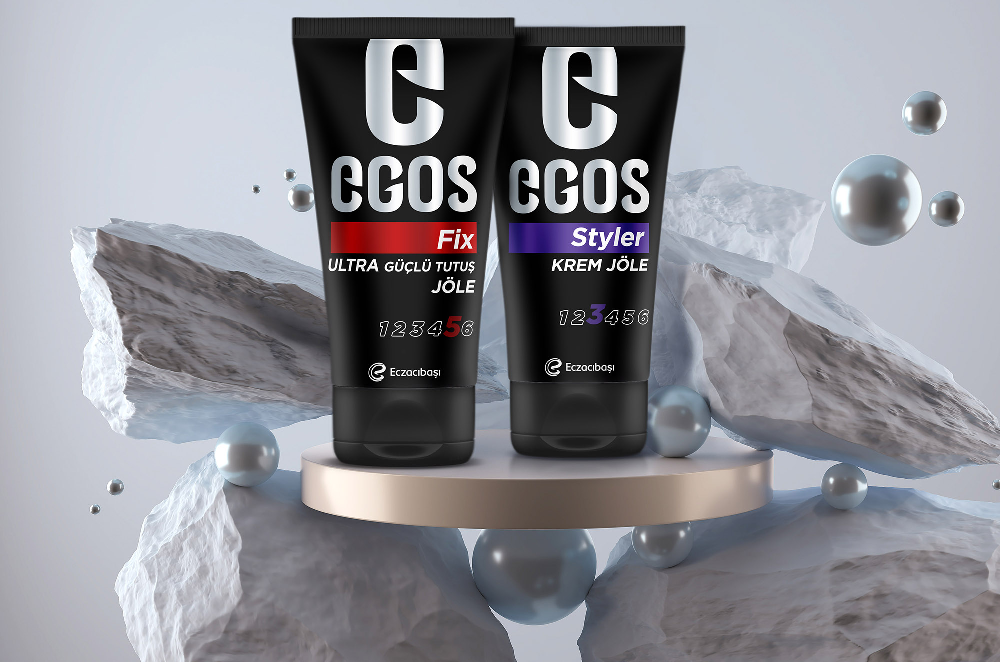
Egos entered the market years ago as a men’s brand. However, as the market became unisex, while trying to adapt itself to it, it could not get market share from both women and men lost their market share. The brand asked us to make them look masculine again.

Egos
Brief
Solution
We started with a strong Egos logo on black. We have completed the design on the lower part of the logo with strong phosphorescent colors to clearly understand both the variant names and the variant distinctions. By taking care that the packaging is matte in general, we made it look more modern and clear.
Result
We have created a more masculine Egos brand with a stronger and masculine logo, an easily readable hardness indicator and variant names that can easily be distinguished from each other with luminous colors.
Project Date
2018
Awards


