Sana, One of Turkey’s Most Iconic Brands, Gets a Packaging Refresh: A Stronger Brand Identity, A Clearer Shelf Experience
The primary goal of the project was to analyze the brand’s existing distinctive assets and leverage them in a more consistent and powerful way. Our assessment identified the logo and the color red as Sana’s core visual equities.
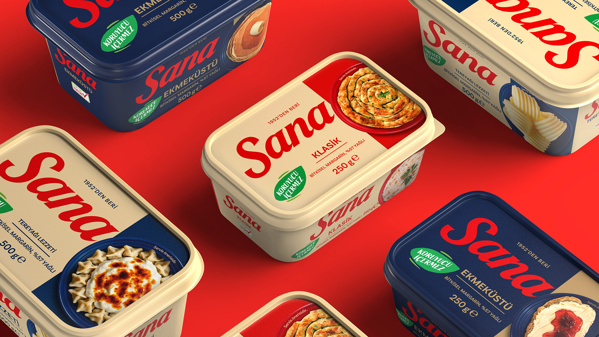
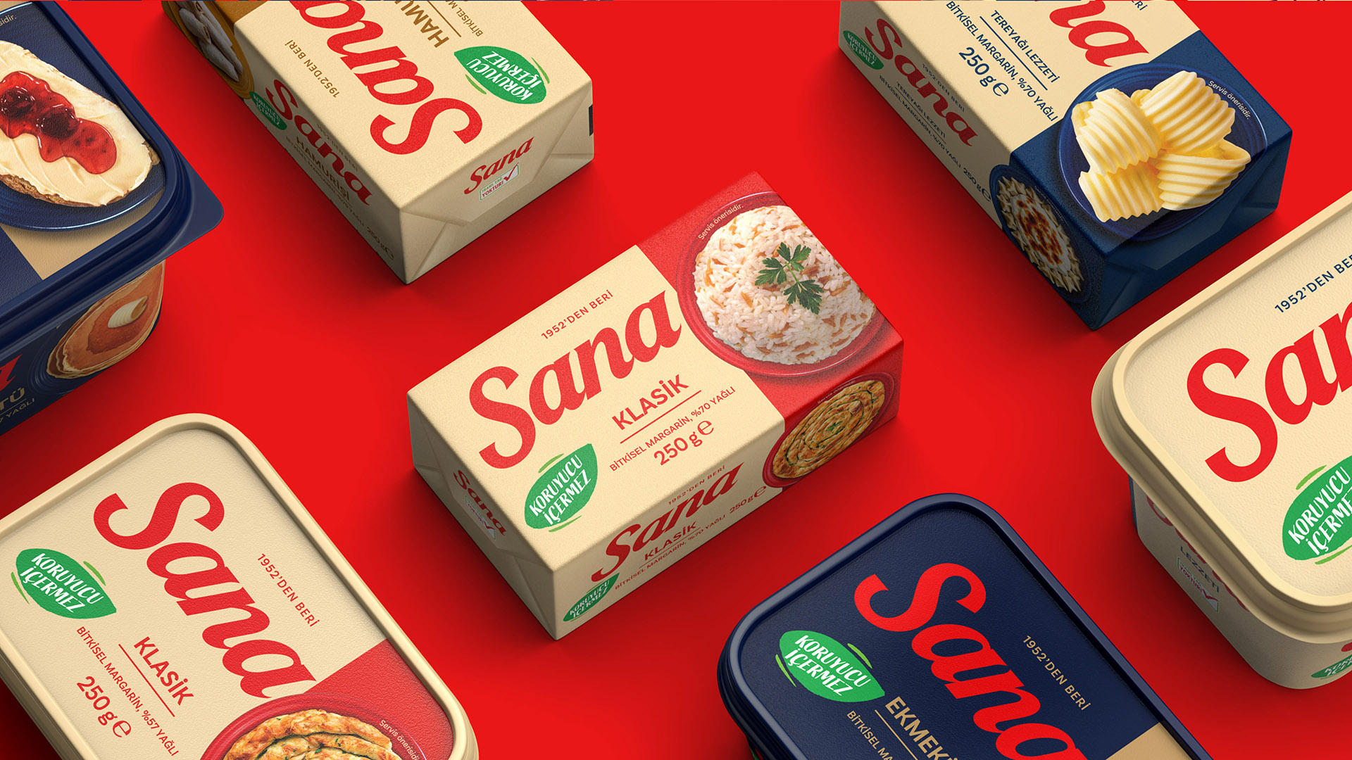
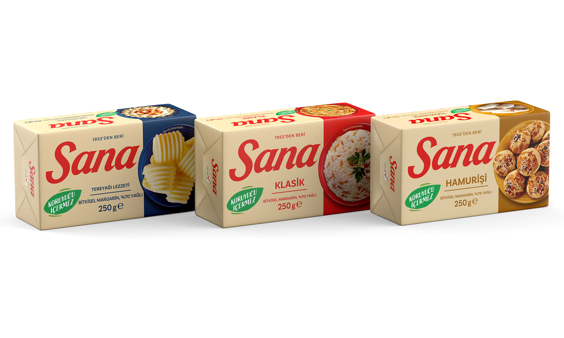
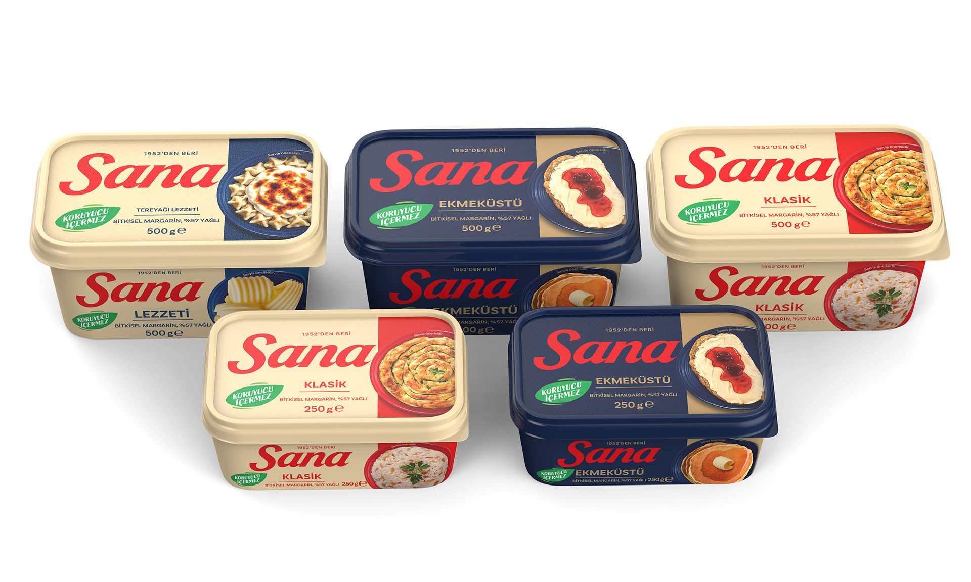
With this in mind, the logo was standardized across all variants with a fixed color treatment; the brand’s signature red was owned more boldly; and the existing cream background was retained to protect consumer familiarity. The brand’s category-defining “Preservative-Free” claim was placed at the center of the pack.
To strengthen variant differentiation, a band structure was introduced on the right side of the packaging. While referencing the stripe language Sana had used in the past, this band clearly distinguishes product variants through distinct color coding for each SKU.
Design Language
The new packaging draws inspiration from Nordic design principles. A clean, functional, and structured visual system was developed to reduce complexity. Food imagery was recomposed with simpler arrangements, presented on Nordic-style plates crafted specifically for Sana, and brought to life with more appetizing lighting. The logo was also enlarged to increase shelf visibility, and the message hierarchy was restructured.
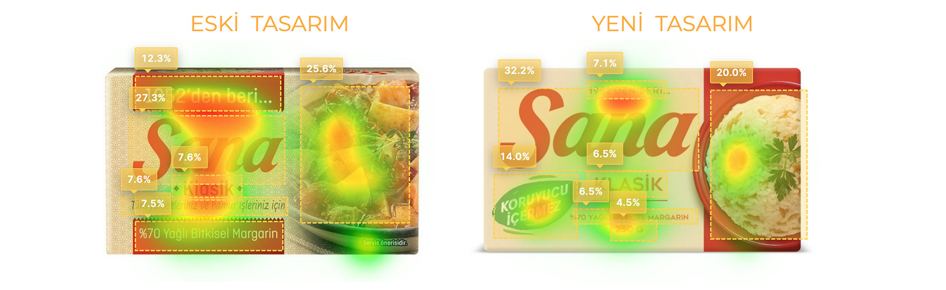
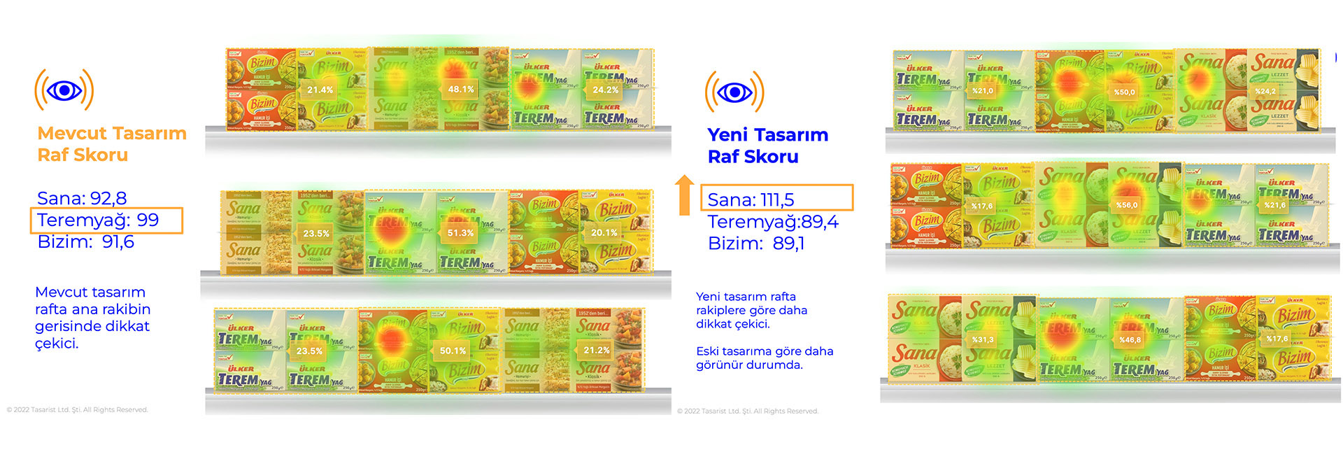
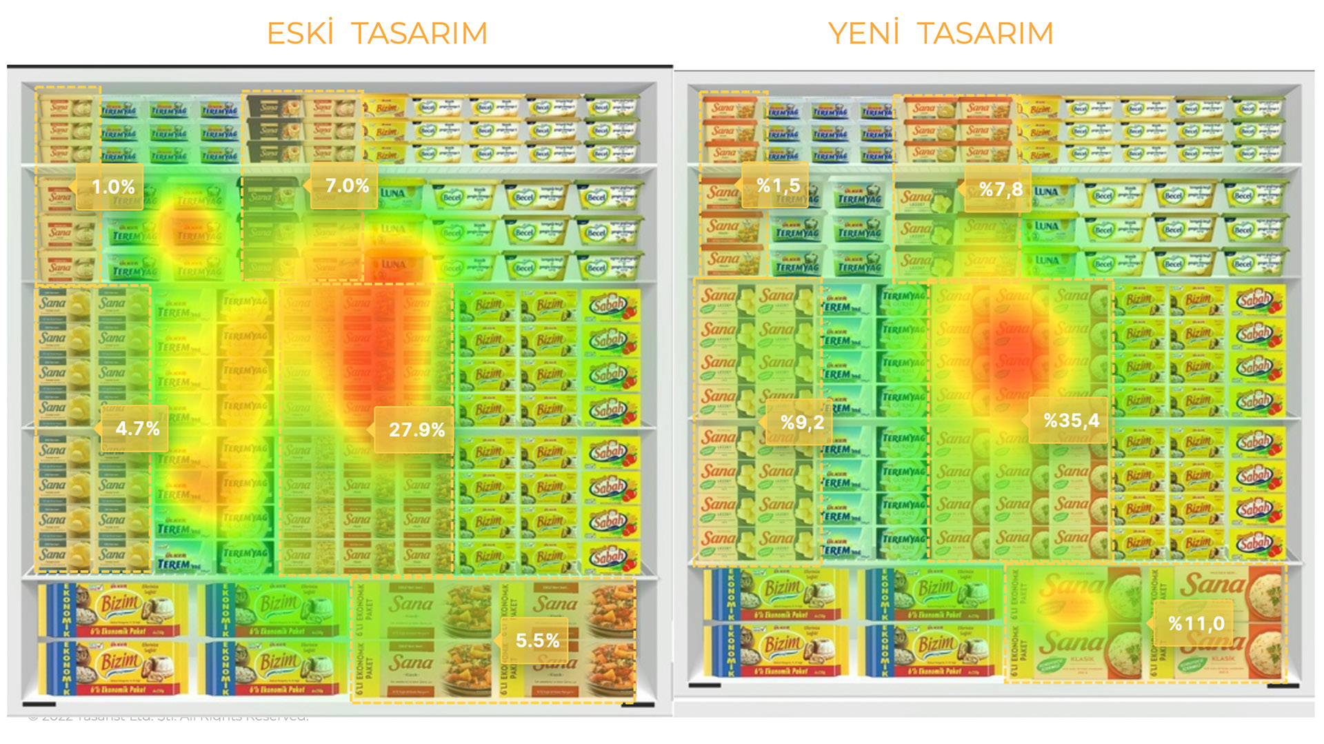
Testing & Optimization
Before hitting shelves, the designs were tested using AI-powered attention analytics. These tests identified consumer focal points and informed the optimization of typography, visuals, and message hierarchy.
Results
The packaging refresh increased Sana’s shelf standout while establishing a more consistent and cohesive brand identity. The new design strikes a balance between honoring the brand’s heritage and meeting the expectations of the modern consumer.