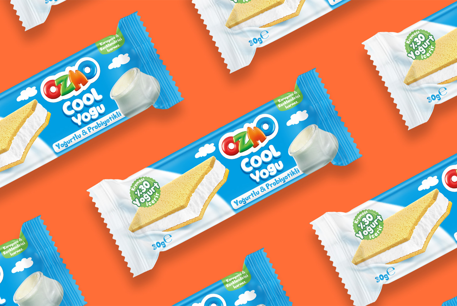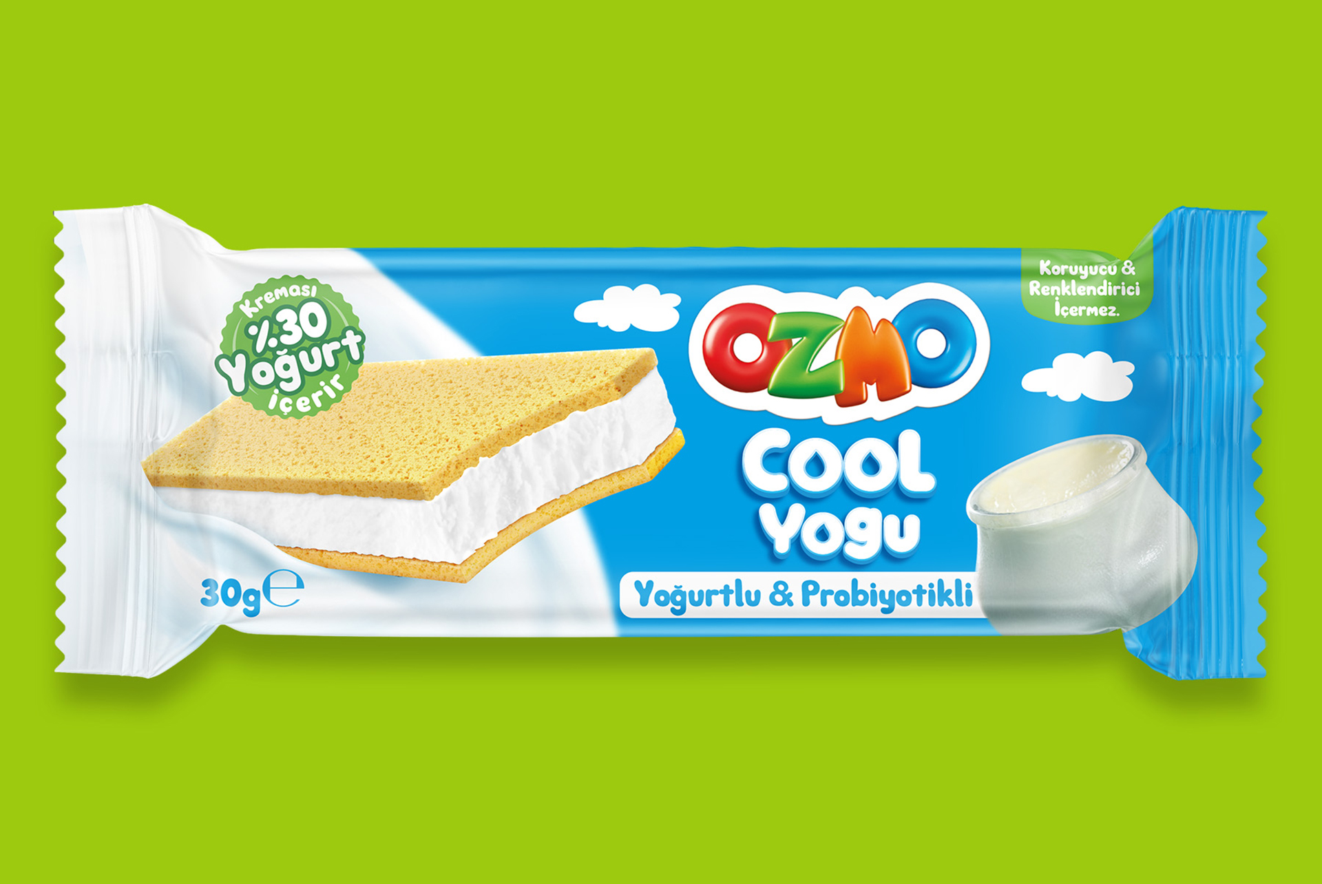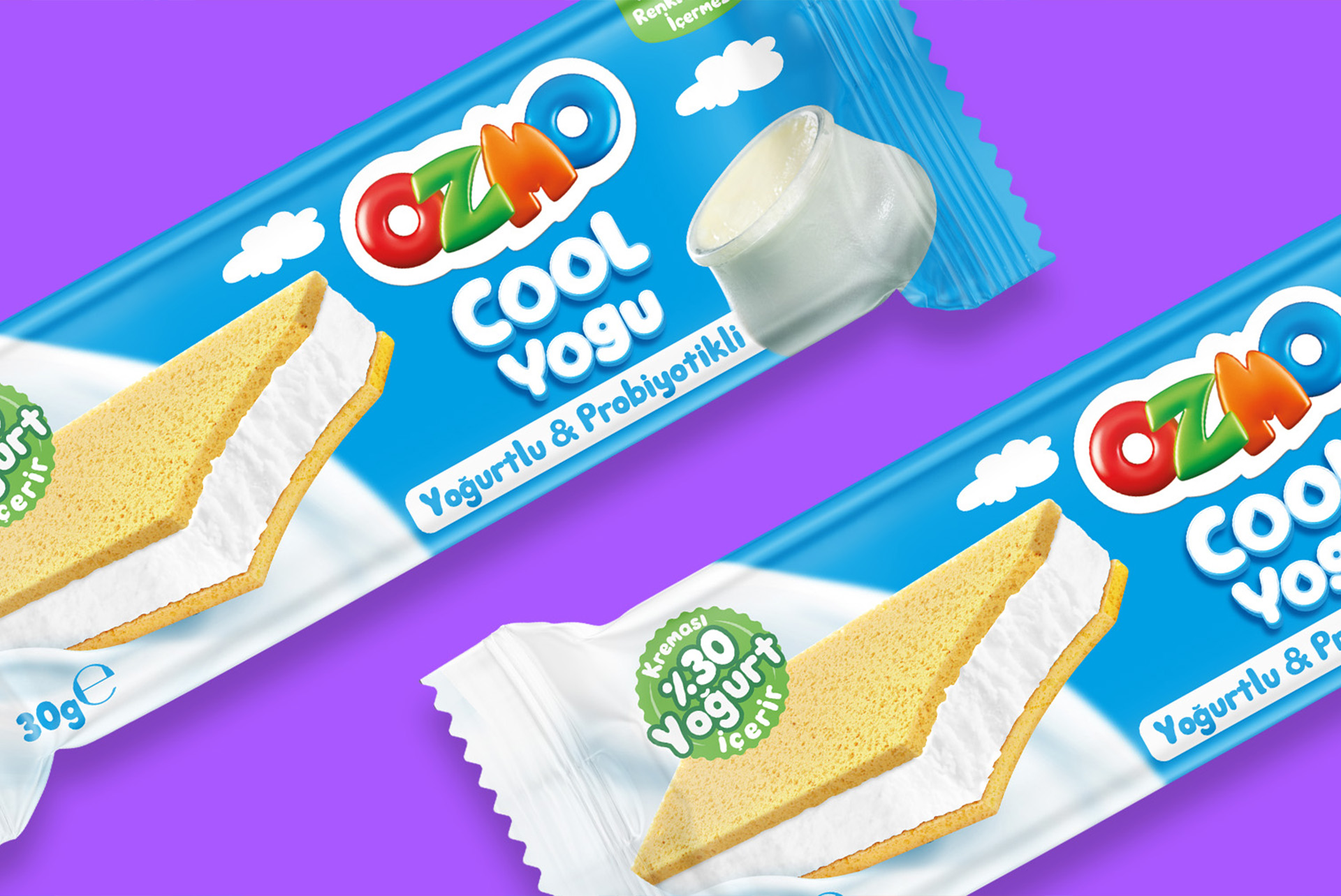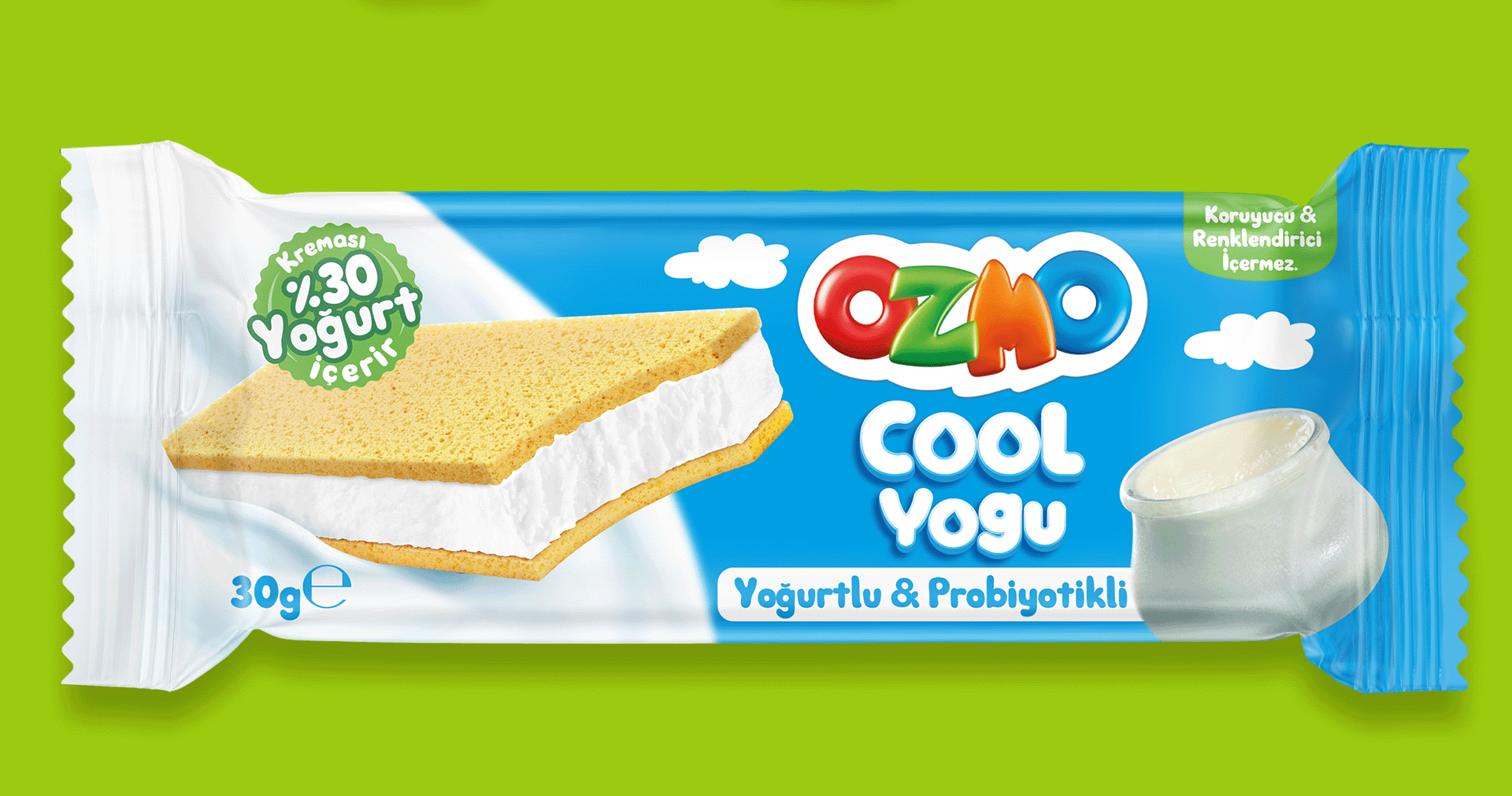
The packaging we designed for Ozmo Cool Yogu has now taken its place on the shelves.
This design emphasizes the product’s yogurt-based content and delicious taste, using a clear, approachable visual language that appeals to both children and adults. Color choices, typography, and visual hierarchy were carefully balanced to ensure the packaging is playful for younger audiences while remaining informative and accessible for parents.
Developed in line with Ozmo’s dynamic brand identity, the new packaging aims to deliver strong shelf impact and effective consumer communication.