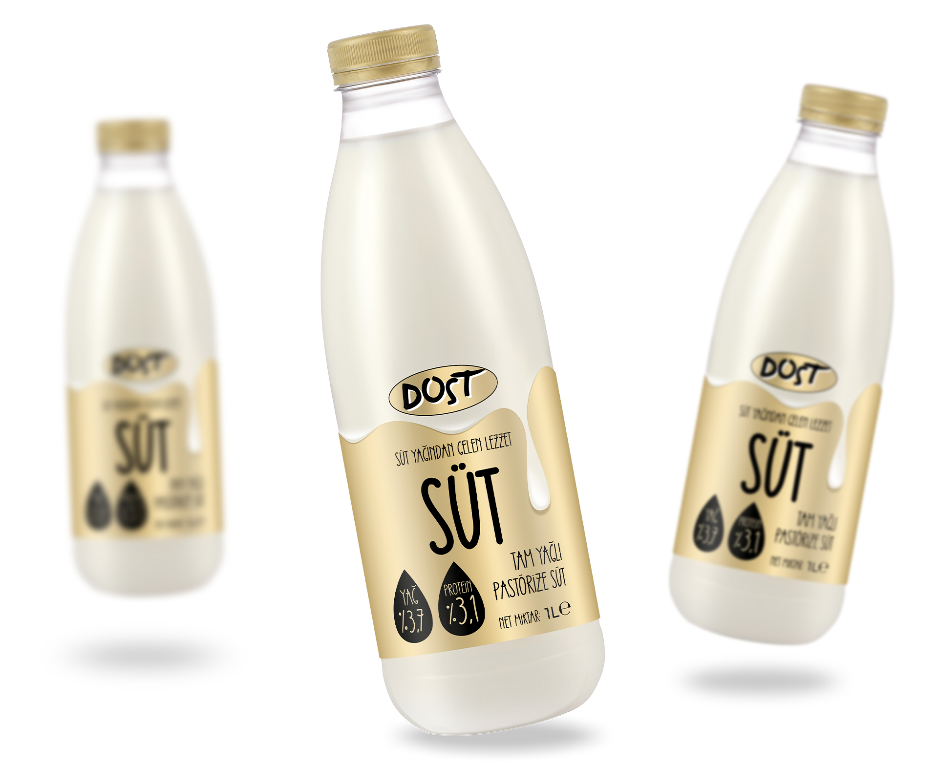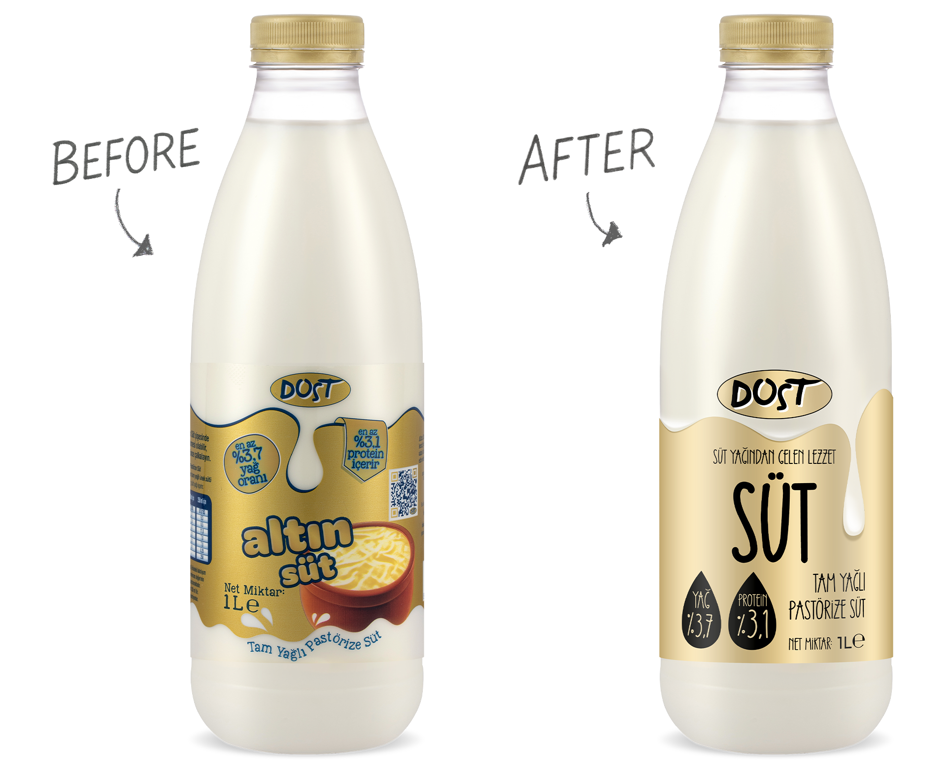
In the redesign of Dost Milk packaging, our primary goal was to preserve the familiar elements that consumers recognize on the shelf while giving the brand a more modern and powerful look.
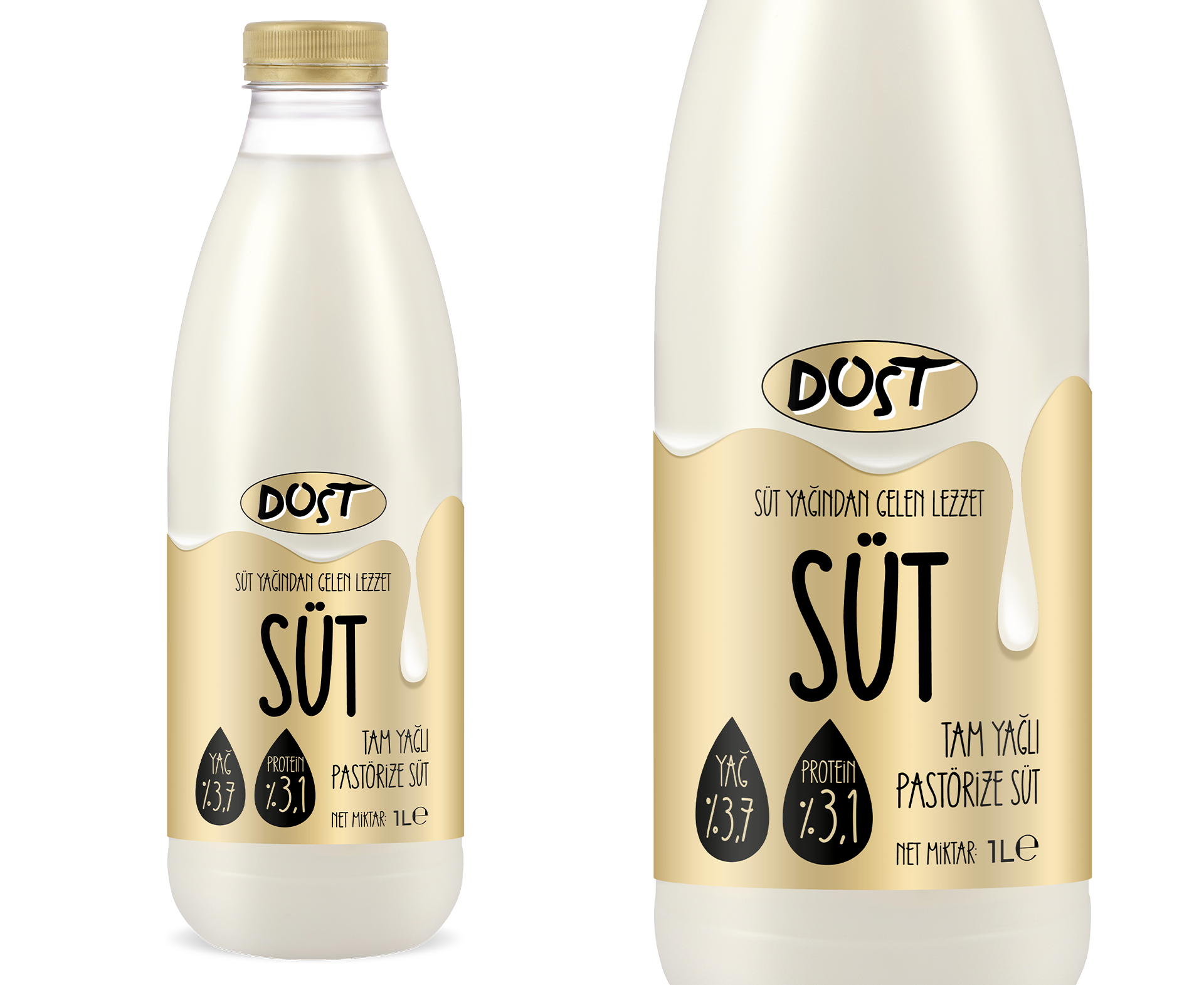
First, we identified the key visual cues that ensure recognition: the gold color, the logo, and the milk pouring effect.
We simplified details that created unnecessary cognitive load, making the design cleaner and more focused.
The logo was enlarged, and the milk drop effect was reinterpreted with a more 3D and impactful look.
The gold tone was refined to strengthen the brand’s premium perception.
Finally, we validated the new design through visual attention tests, ensuring measurable performance.
Result: The new Dost Milk packaging preserves the trusted elements in consumers’ memory while giving the brand a modern, stronger, and more eye-catching identity on the shelf.