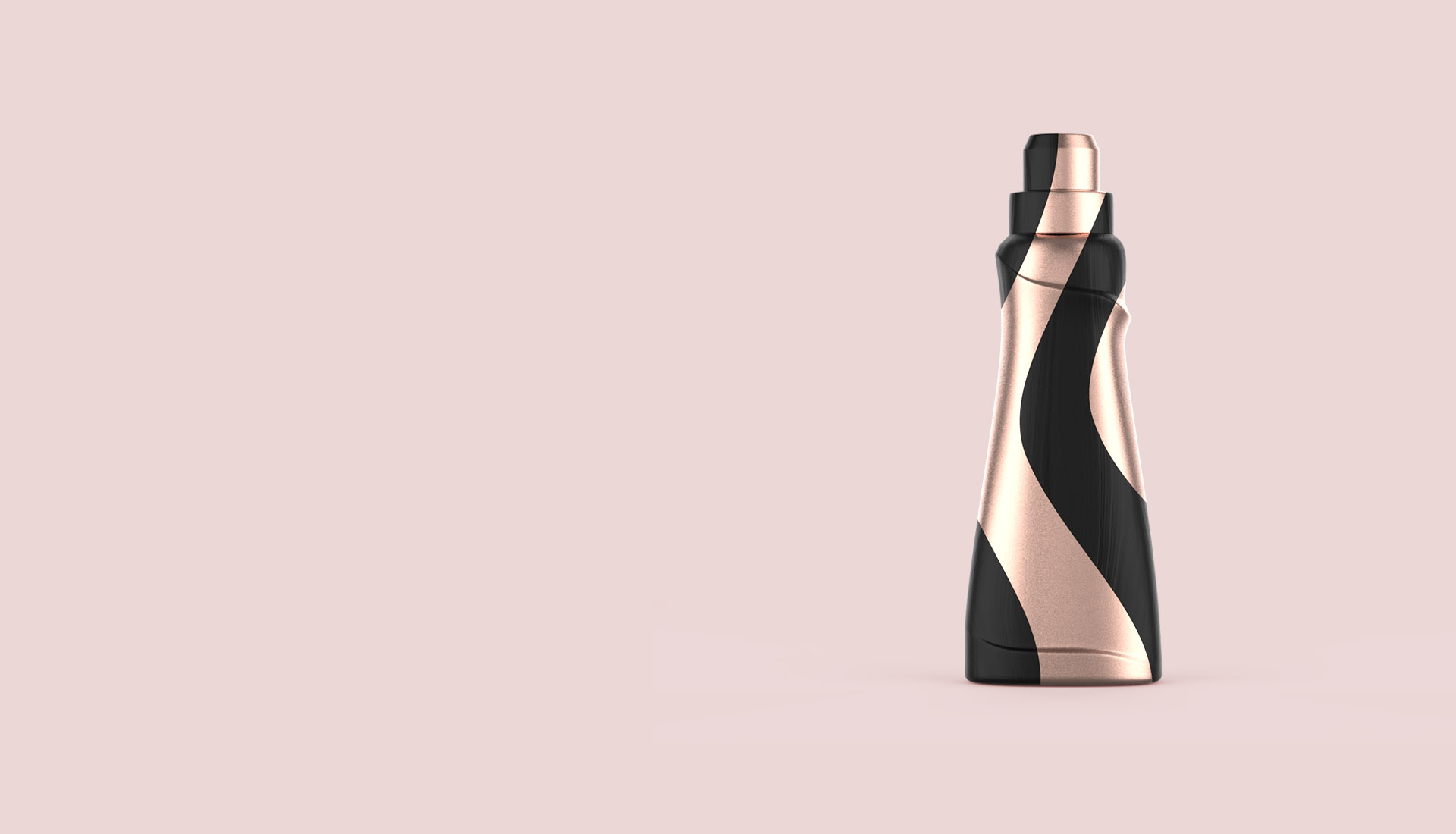
Design alternatives which could emphasize the real perfume effect of the product were demanded for Bingo Soft Premium Line.

Bingo Soft Premium
Brief
Solution
To emphasize the difference and “precious” image of the series, black was preferred as main color of the design. A bottle design which had a feminine and soft form was prepared. The design was heated with fabric wave alike details. Flower figures were applied on bottleneck to give “pure perfume effect is just below the cap” message. Different label and cap colors were preferred for an easier variant differentiation. Fragrance was referred with flower visuals applied on the labels and gold effect was used on logo and writings for a stronger perception of excellence. Design process was completed with handwriting-looking font to highlight that the product is “special and different”.
Result
The new designs brought a new perspective to its category. The project was also awarded by prestigious national and international authorities.
Project Date
2014
Awards
APF AsiaStar, Crescent and Stars of Packaging


